Explore the charm of font collocation in wayfinding signage system design
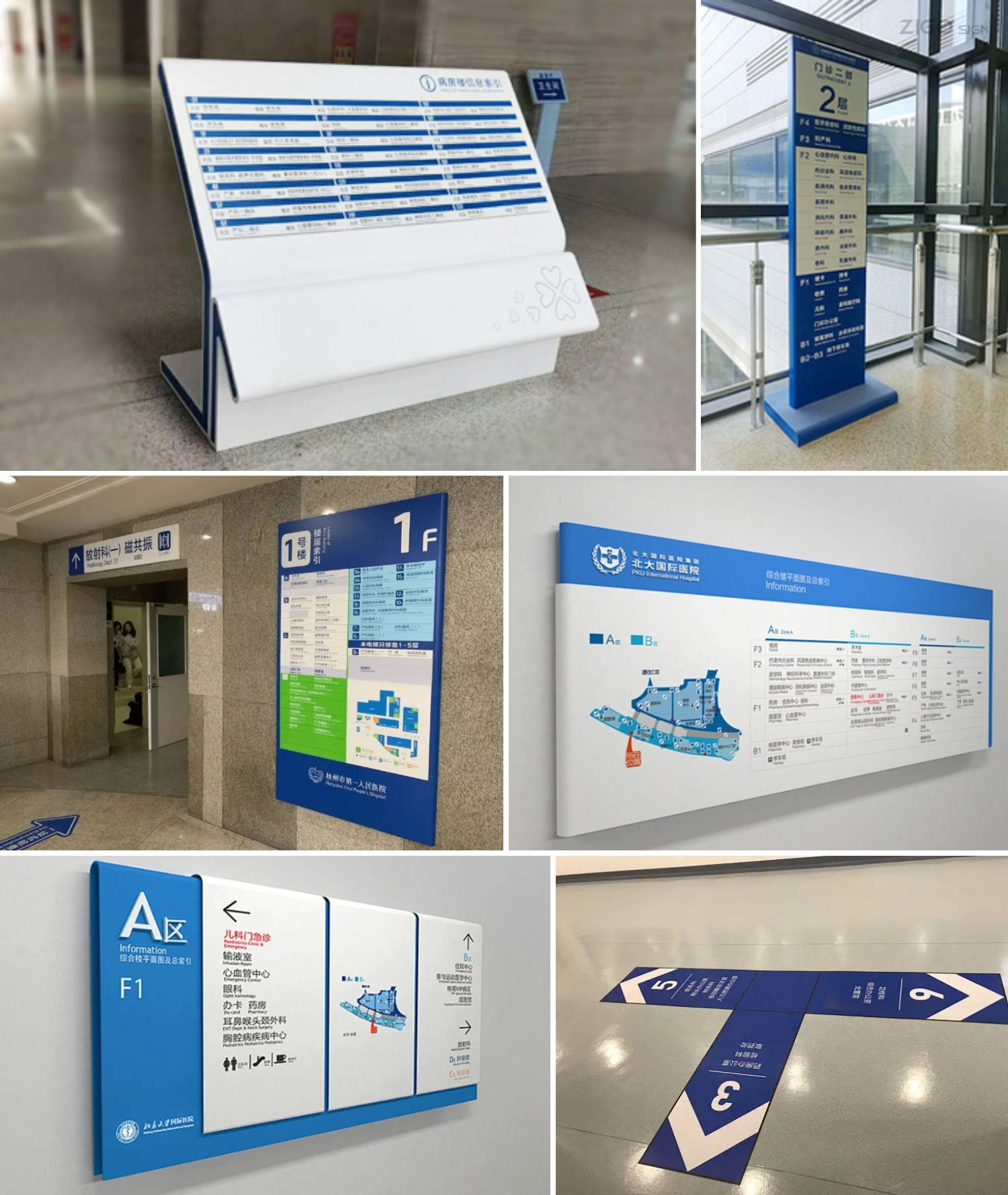
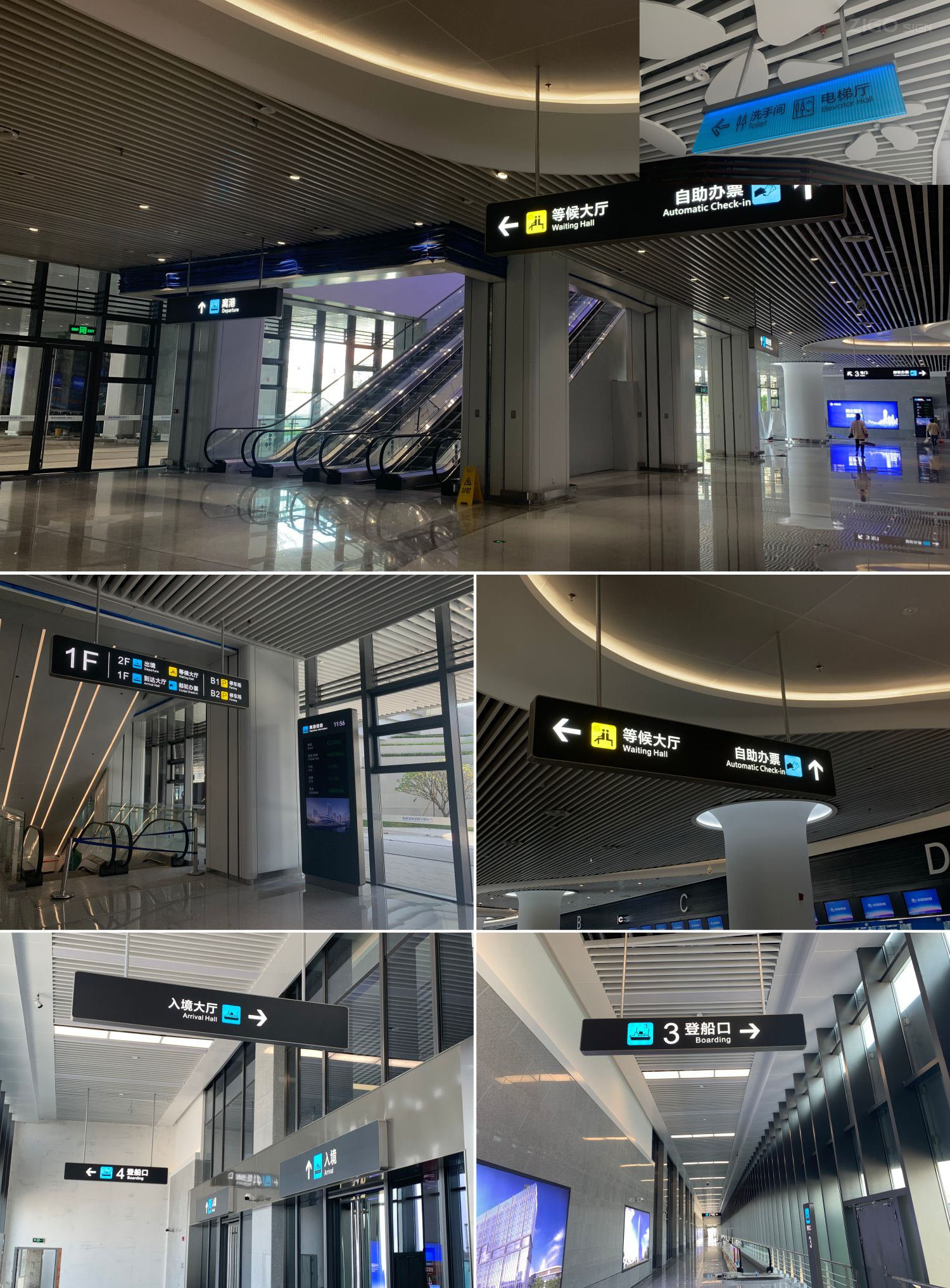
In today's complex environments, wayfinding system design is becoming increasingly important. Whether in a busy shopping mall, a vast airport, or a complex hospital, effective wayfinding allows people to find their way quickly and accurately. One of the key factors in attracting attention is the font size and thickness of the text on the signage.

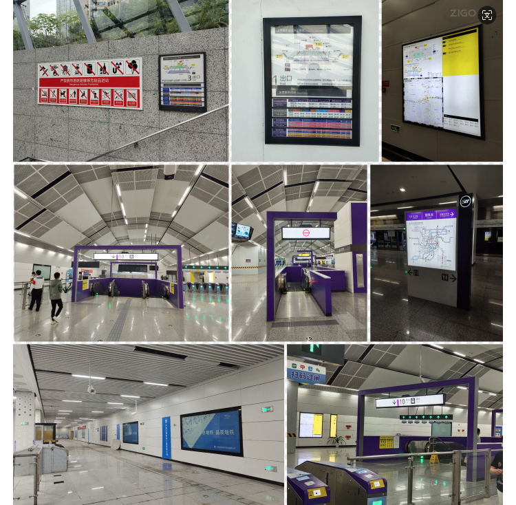
In public places with large flow of people, such as subway stations, larger and thicker fonts can attract people's attention at a distance and quickly deliver key information. In quieter and more detailed places, such as art galleries, slightly smaller and more delicate fonts can create an elegant atmosphere without destroying the overall aesthetics.

The matching of font size and thickness should fully consider the needs of the audience and environmental characteristics. For example, for people with poor eyesight or older people, clear, large and bold fonts are more convenient for them to access information. In fashionable neighborhoods where young people predominate, creative and varied fonts can stimulate their interest.

We have to make clear the importance of reasonable matching of font size and thickness in the design of guide signage system. The signage system not only relates to the effective delivery of information, but also enhances people's experience and brings more convenience to our lives.
ZIGO will continue to explore and innovate, combining advanced technology and humanized concepts to create even better tactile signage systems, making our cities and living spaces more convenient and comfortable. What do you think about the matching of fonts in the signage system? Welcome to continue to participate in our discussion.