 Email
Email WhatsApp
News


The main purpose of setting up guide signs at subway stations is to facilitate people to find the route information of the destination they need to go to under the establishment of these signs, so that they can reach the destination accurately without wasting time. Therefore, the layout of subway signs needs to consider the content layout of the route and the sign system design to facilitate user identification. So how should the subway station guide sign design be laid out to make tourists see it at a glance?
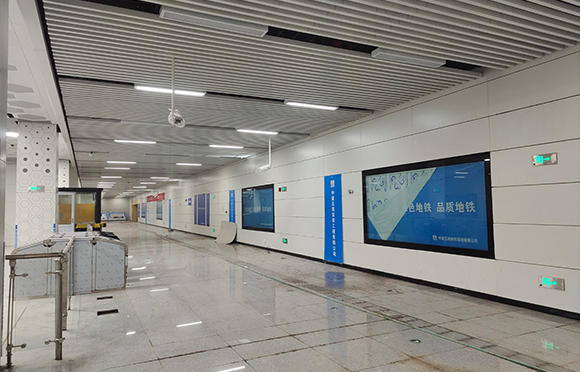
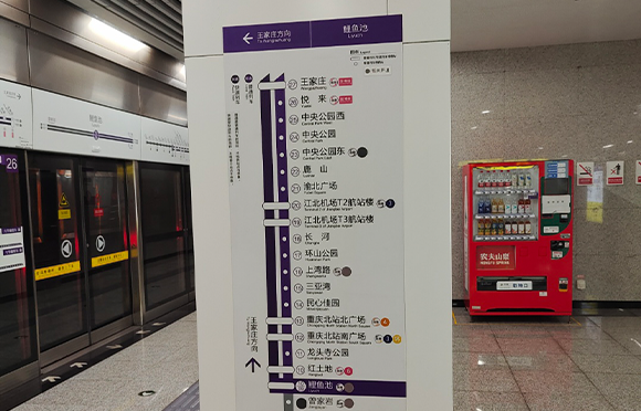
1. Reasonable location layout. When setting up signs, it is necessary to plan the points according to the line of movement of people in the subway station, set up in some eye-catching locations or the intersection of the circulation channel with large traffic flow, or on the main channel with large traffic flow. Give full play to the role of identification and guidance. Then you also need to pay attention to the signs at some subway station entrances and exits, station entrances, and safety passage intersections. In order to prevent emergencies at the subway entrance, some emergency fire evacuation signs or emergency exits should be set up in the subway station. This kind of sign is different from the general guide sign, so when setting it up, you should consider whether it is standardized and whether it can reflect its role.
2. The color layout of the guide sign design. This color layout refers not only to the overall color of the guide sign, but also to the color selection of the content of the picture. Pedestrians can distinguish the meaning of the sign through these signs. The color selection of the subway station guide sign needs to be visually attractive. In order to bring great visual effects to everyone, it is necessary to choose unique true colors and secondary intermediate colors. Avoid excessive use of colors. It is best to use dark colors as the background color, with text or graphic icons with strong contrasting colors.
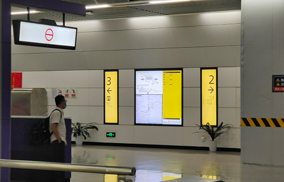
3. Text layout of guide sign design. Because many guide signs will use some text to annotate the important content, the layout design of the text needs to express accurate information, and the text should not use too complex fonts. It needs to be easy for users to read and for passengers to find the location and entrance and exit of the subway.
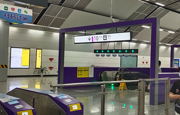
4. Pattern layout of sign guide. Guide sign design usually uses a lot of patterns to improve the expression of the sign, and patterns can also be used to increase the visual beauty of the sign. The actual role of the pattern and text in the subway station sign design is the same. The advantage of pattern design is that passengers are not restricted by age and culture. Some younger children or uneducated people may not understand text icons. Adding graphic design can enable these users to find their destination intuitively. Currently, the icons of subway stations are all planned using national standard guide icons.