 Email
Email WhatsApp
News

Effective wayfinding signage in hospitals is crucial to ensure a seamless and stress-free experience for patients, visitors, and staff. Given the complex layouts and high-pressure environment of healthcare facilities, clear and intuitive signage helps people navigate efficiently, reduces anxiety, and improves overall operational efficiency. Below are the best practices for hospital wayfinding signage, structured to provide clarity, accessibility, and functionality.
- Use simple, universally understood language and avoid medical jargon.
- Incorporate large, legible fonts that are easy to read from a distance.
- Limit the amount of information on each sign to avoid overwhelming users.
- Maintain uniformity in design elements, such as typography, color schemes, symbols, and placement throughout the facility.
- Follow a standardized wayfinding system to create predictability for users.
- Place signs at eye level or in clearly visible locations, such as entrances, intersections, and elevators.
- Use contrasting colors for text and background to ensure readability, even for individuals with visual impairments.
- Ensure signage is inclusive for all users, including those with disabilities.
- Include Braille and tactile elements for visually impaired individuals.
- Comply with accessibility guidelines, such as the Americans with Disabilities Act (ADA).

- Indicates specific locations, such as rooms, departments, or services (e.g., "Emergency Room" or "Radiology").
- Use clear labels with consistent terminology.
- Guides users through corridors and intersections using arrows and landmarks.
- Example: "Cafeteria →" or "Laboratory ←."
- Provides general information or instructions, such as facility maps, operating hours, or safety procedures.
- Example: "Restrooms are located on each floor."
- Conveys safety and compliance messages, such as "No Smoking," "Restricted Area," or "Emergency Exit."
- Use universally recognized symbols alongside text for clarity.

- Use sans-serif fonts like Arial or Helvetica for improved legibility.
- Maintain font sizes proportional to viewing distances (e.g., 1 inch of letter height for every 10 feet of viewing distance).
- Adhere to high-contrast color combinations (e.g., black text on a white background or white text on a dark blue background).
- Use colors consistently to represent specific zones or functions (e.g., green for patient areas, blue for administrative areas).
- Use universally recognized symbols, such as the wheelchair icon for accessibility or the fork and knife for dining areas.
- Supplement symbols with text to aid comprehension for users unfamiliar with the iconography.
- Ensure signs are well-lit for visibility in both day and night conditions.
- Use backlit signs or LED technology in dimly lit areas.
- Position signage at decision points, such as entrances, staircases, and hallway intersections.
- Avoid clutter by ensuring signage is not obscured by decorations, furniture, or other visual elements.
- Use ceiling-mounted signs in large, open spaces like lobbies.

- Install digital kiosks or interactive screens in high-traffic areas to provide dynamic directions and real-time updates.
- Ensure digital interfaces are intuitive and accessible for all users.
- Offer mobile apps or QR codes that visitors can scan to access maps, step-by-step directions, or other navigation tools.
- Enable GPS-like indoor navigation for enhanced convenience.
- Use digital signage to quickly update information in case of temporary closures, construction, or emergencies.

- Divide the hospital into zones or wings, each assigned a unique identifier, such as a letter, number, or color.
- Example: “Blue Wing, Floor 2” or “Zone A, Pediatrics.”
- Use color-coded pathways on floors, walls, or ceilings to guide users visually to their destinations.
- Reinforce this system with corresponding colors on printed maps and digital wayfinding systems.

- Provide clear directions from entry points (e.g., parking lots or main entrances) to key destinations, such as reception desks, waiting areas, or consultation rooms.
- Place “You Are Here” maps at critical decision points.
- Include translations in languages commonly spoken in the community.
- Use pictograms to aid understanding for non-native speakers.
- Incorporate calming design elements, such as soothing colors or soft lighting, to reduce stress.
- Position waiting area signage near comfortable seating zones.

- Periodically inspect signage for wear and tear, visibility issues, or outdated information.
- Replace damaged or faded signs promptly.
- Conduct surveys or interviews with patients and visitors to identify navigation challenges.
- Use feedback to refine and improve the wayfinding system.
- Train staff to understand the wayfinding system so they can assist visitors effectively.
- Use eco-friendly materials for physical signage, such as recycled or biodegradable components.
- Opt for energy-efficient digital signage solutions.
A well-designed hospital wayfinding system enhances the patient experience, streamlines operations, and reduces stress for all users. By prioritizing clarity, accessibility, and adaptability, hospitals can create an intuitive navigation environment that caters to diverse needs. Investing in both traditional and digital wayfinding approaches ensures a balance between functionality and modernity, setting a benchmark for patient-centered care.
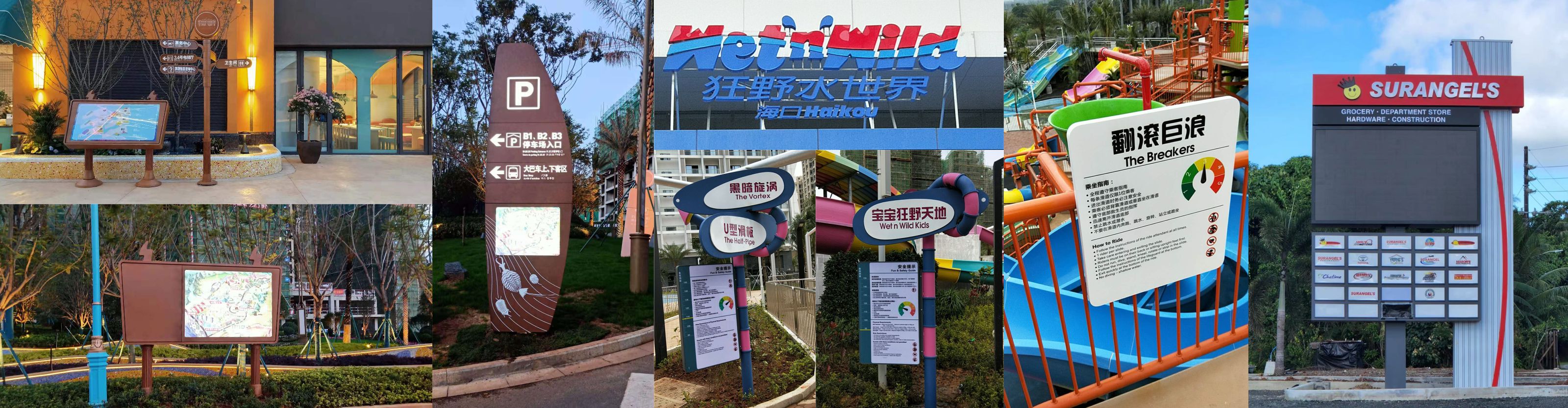
ZIGO Sign specializes in creating intuitive wayfinding sign design and solutions for a diverse range of markets, including hospitality, healthcare ,public buildings, high-end shopping malls, and luxury real estate.
For assistance in implementing a high-quality wayfinding system in your facility, visit https://www.zg-sign.com.